TriPlan Website & App
This website uses AI to tailor personalized travel packages


Triplan primarily functions as a Business-to-Consumer (B2C) platform. that utilizes AI to recommend travel planning for travelers and explore personalized suggestions for users through sale packages. It connects users to hotels and flights while offering accommodation suggestions, tours, Budget, desired activities and travel planning.
TriPlan was developed by a team of three during my participation in the UX-Land bootcamp. We have a curious team exploring AI to enhance the travel experience. Our emphasis is on creating fast, user-friendly personalized packages and assistance, with a focus on budget setting. We designed an adaptive website for both mobile and desktop devices, concentrating on UX design and the user interface aspect.
Timeline
3 Months-Part time
Teams
Group of 3
My role
User Researcher,
Interaction Designer
Project Overview
Tools


Our Target
Travelers: Users with limited time and vacation opportunities.
Goal
We aim to use an AI search engine that works like human intuition to explore how AI can enhance the travel experience by providing personalized and intuitive solutions.
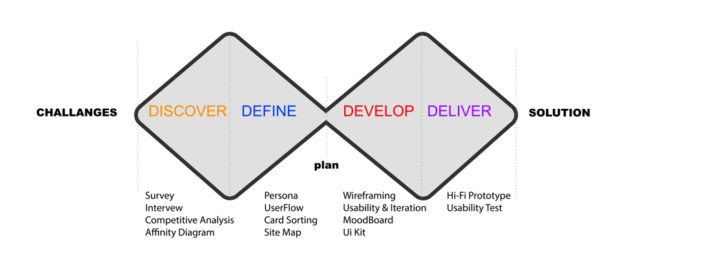
Design Process
DELIVER
The Solution
Final design first: a glimpse before the deep dive

Challenges
Building trust in AI is challenging, as many people don't know how to use or interact with it.
To make new technology comfortable and user-friendly, ensuring it is realistically exportable and accessible.
To present a simple and usable filter based on AI suggestions for users and access it on all pages.
Travelers have a daily plan and can modify it by changing or rescheduling it smoothly
Business Goal
Explore AI to create personalized trip plans by connecting users with trusted local travel and sale packages.
Helping users travel more efficiently and modifying their itineraries as needed.
Access most important travel needs in one place: destinations, adventures, deals, and maps.
Two-way connections: Allow users to connect with other providers for additional services and enable other providers to join the Triplan website.
Discover
DISCOVER
Survey
We asked 56 people about using an AI travel planner to see if travelers can trust it. We looked at things like safety and how much AI versus human help is needed.
Takeaway
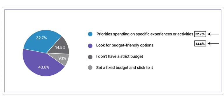
Set a budget to avoid overspending and ensure enough funds for all aspects of the trip. Use AI to forecast travel trends, seasonal variations, and more (43.6%).
AI compares prices for accommodations and activities to help travelers find the best deals within their budget.(32.7 %)
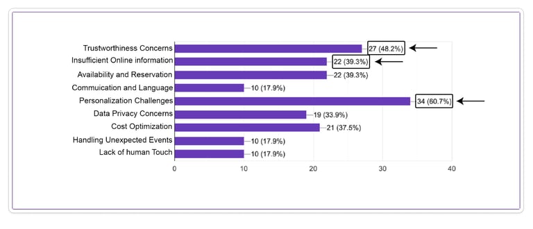
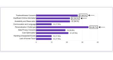
Users may hesitate to use an AI travel planner website due to various reasons, including:
The most important part for travelers to help them for finding a packages are:
Personalized Challenges to their specific preferences and concerns about data privacy. (60.7 %)
Trustworthiness Concerns in AI refer to doubts about the reliability, accuracy, and ethical use of AI systems.(48%)
Concerns about complex online information (22%) relate to users' uncertainties and challenges in understanding and navigating intricate digital content
Interview & Affinity Diagram
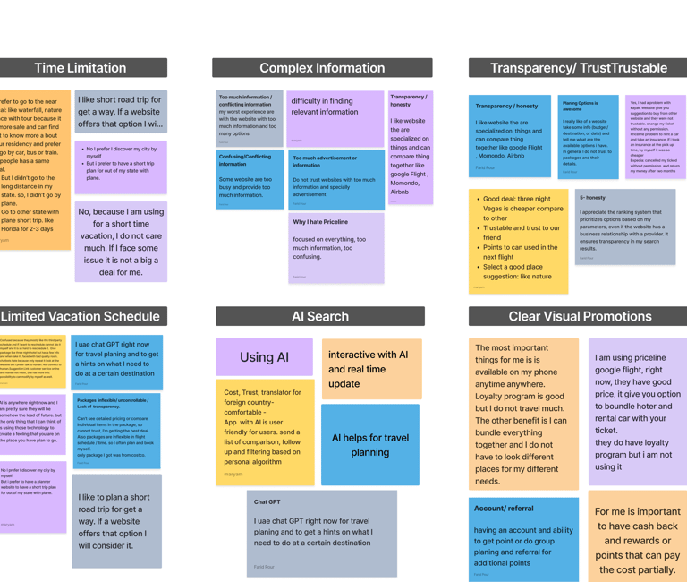
After conducting the survey, we conducted interviews with 8 participants to better understand their pain points, focusing more on travel scheduling by utilizing a robust AI search engine.
Takeaway
Travelers find travel planner websites confusing due to too much info and unclear details and AI can simplify the travel planning process by providing personalized suggestions based on user preferences, past behaviors, and travel patterns.
Travelers with limited vacation time need to save time, and AI helps them quickly find customized packages.
AI-powered travel search provides clear functionality, trustworthiness, quick and reliable searches from verified sources, and user control for efficient and transparent travel planning.
Competitive Analysis
We reviewed various travel websites, with a particular focus on Airbnb for its clear search engine, and Wonder Plan and TripIt for their use of AI in search, modification, availability, and scheduling.By studying these platforms, we gained valuable insights to enhance the user experience of our product. We applied these findings to improve our information architecture and user flow.
Takeaway
How to use an AI to personalize search results based on user preferences, improving the overall experience.
Travelers need an AI-powered search engine that is easy to use and provides trustworthy results quickly.
Define
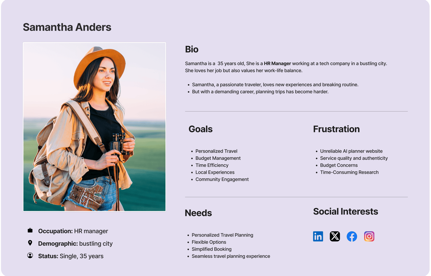
The insights I gained from surveys and interviews helped shape the persona. Samantha's main goal is to find a trustworthy, personalized travel package for a short-term local travel experience to save time.
DEFINE
Persona
The insights I gained from surveys and interviews helped shape the persona. Samantha's main goal is to find a trustworthy, personalized travel package for a short-term local travel experience to save time.
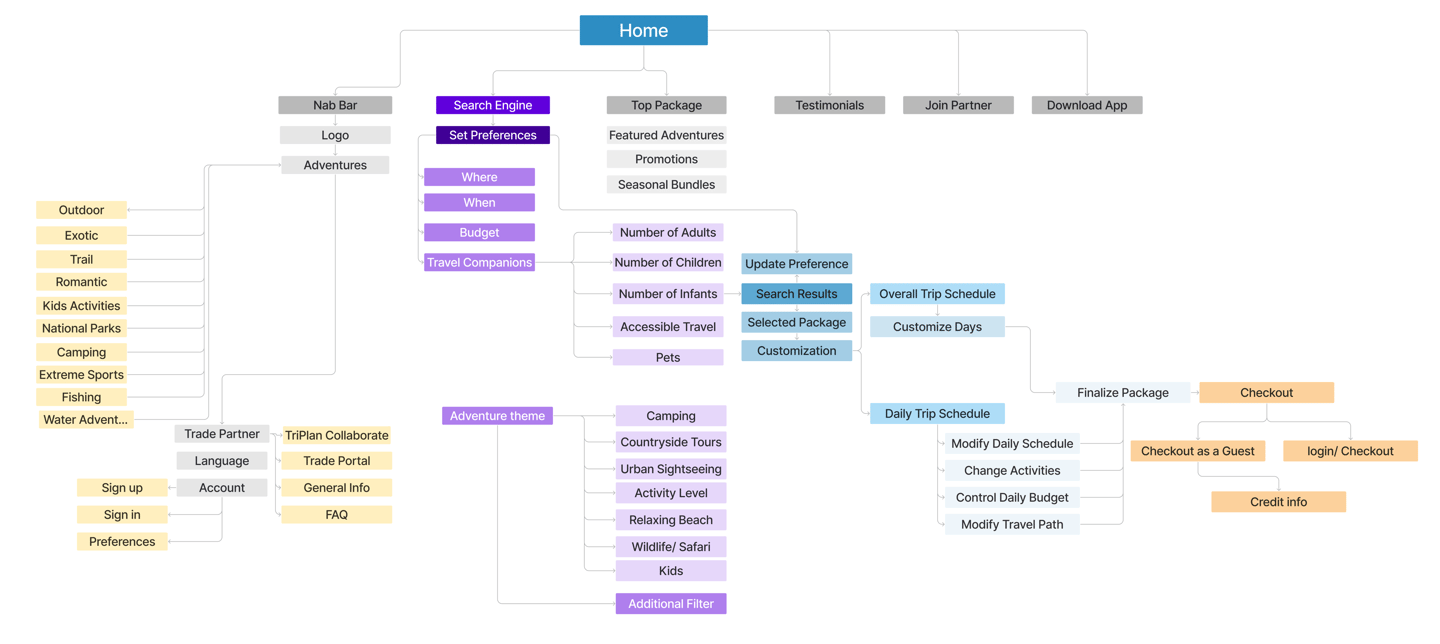
Site Map
We created the initial version of the information architecture based on card sorting. However, through user testing and competitive analysis during the design process, the final version underwent multiple iterations.
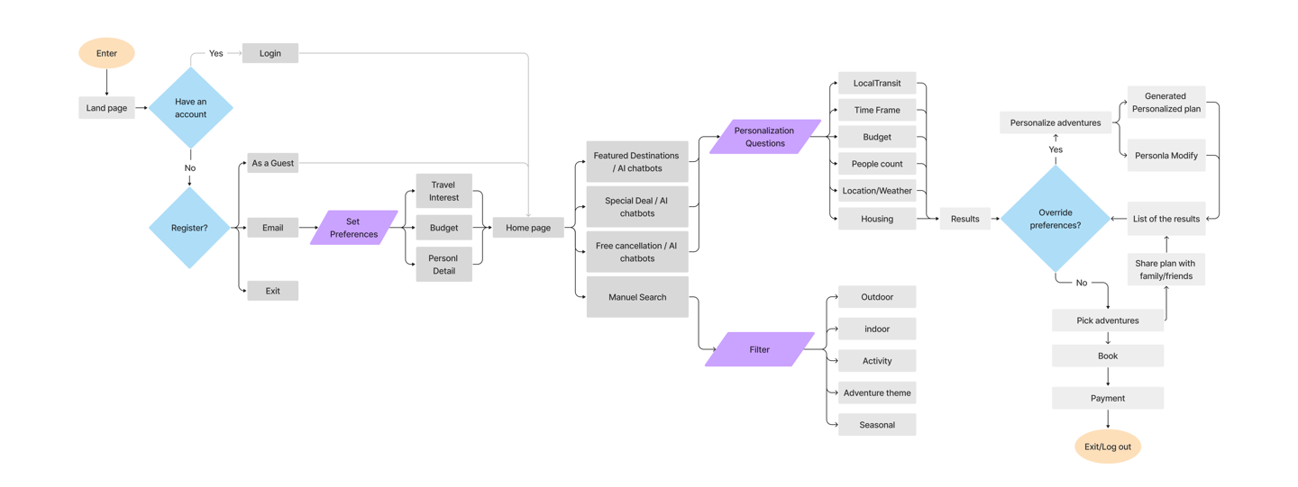
User Flow
In designing the user flow, our aim was to personalize a trip and use AI to find a trip package and tour. Additionally, you can share the plan with family and friends and check it later.
Develop
DEVELOP
Design Thinking
Challenges
2- Travelers can access adventure themes, filters, maps, personalized packages.
Enable users to access the Adventure Theme with slider bar is easy to use
Solutions
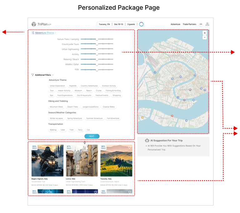
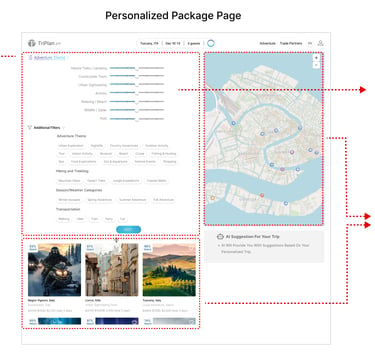
3- Ensure clear notification information is provided in both the content and map directions for travelers after each modification.
Using a GIF notification icon and an information box for clarity in both content and map sections makes it easier for users to identify changes quickly. Having both side by side enables users to see changes after each modification.
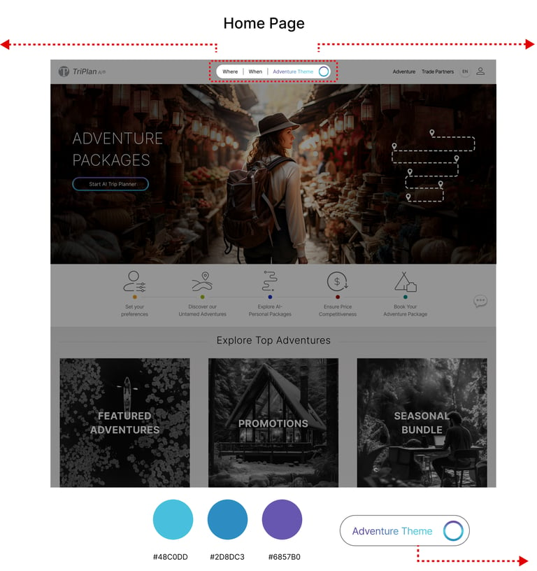
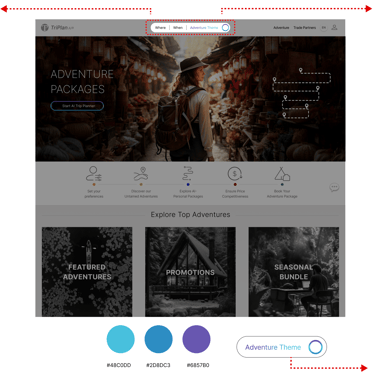
1- Travelers need to access the search engine and adventure themes on all pages to prioritize speed and use a theme to show the adventure theme with the help of AI.
Adding a search engine and AI search at the top of the website header on all pages allows users to see results based on personalized adventure theme changes.
Adding a gradient color scheme ranging from blurred purple to symbolize the collaboration between AI and human input.
Additional filters on multiple pages during trip planning help travelers see the progress of their trip by showing changes in the package and tracking their position on the map.
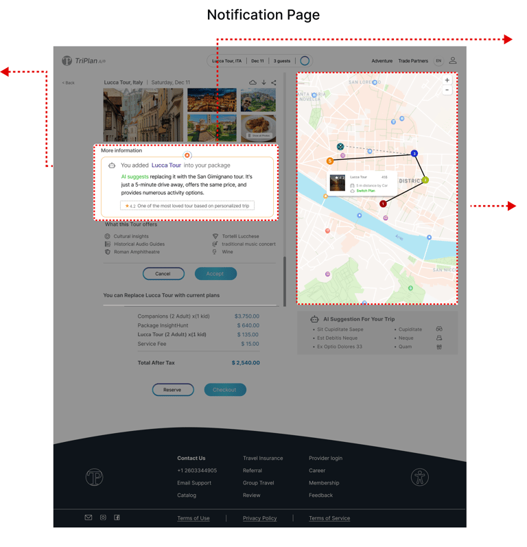
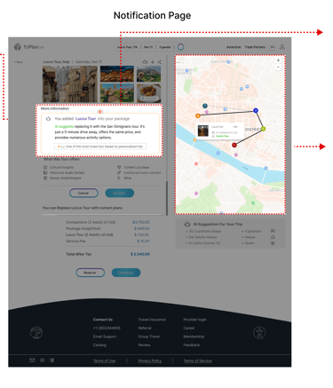
Additionally, it includes a section where AI suggestions are indicated by changing the color to green, based on the estimated consumption time and distance.
Sketches & WireFrames
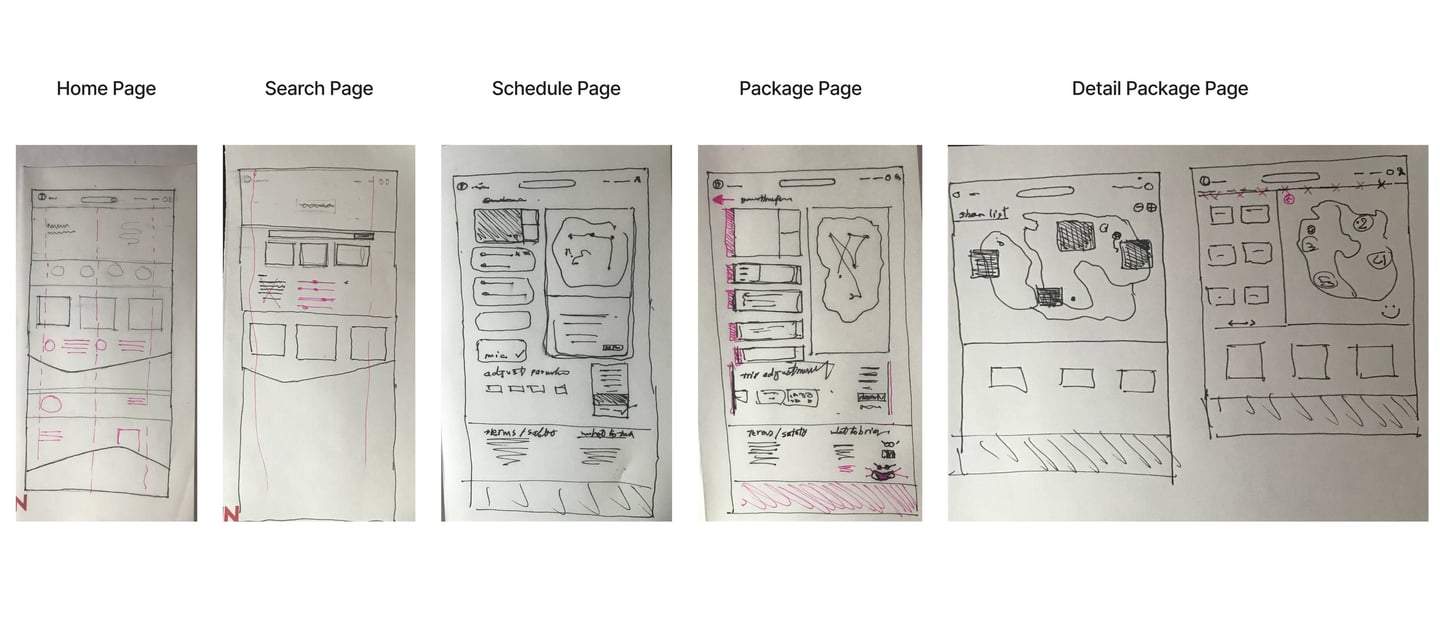
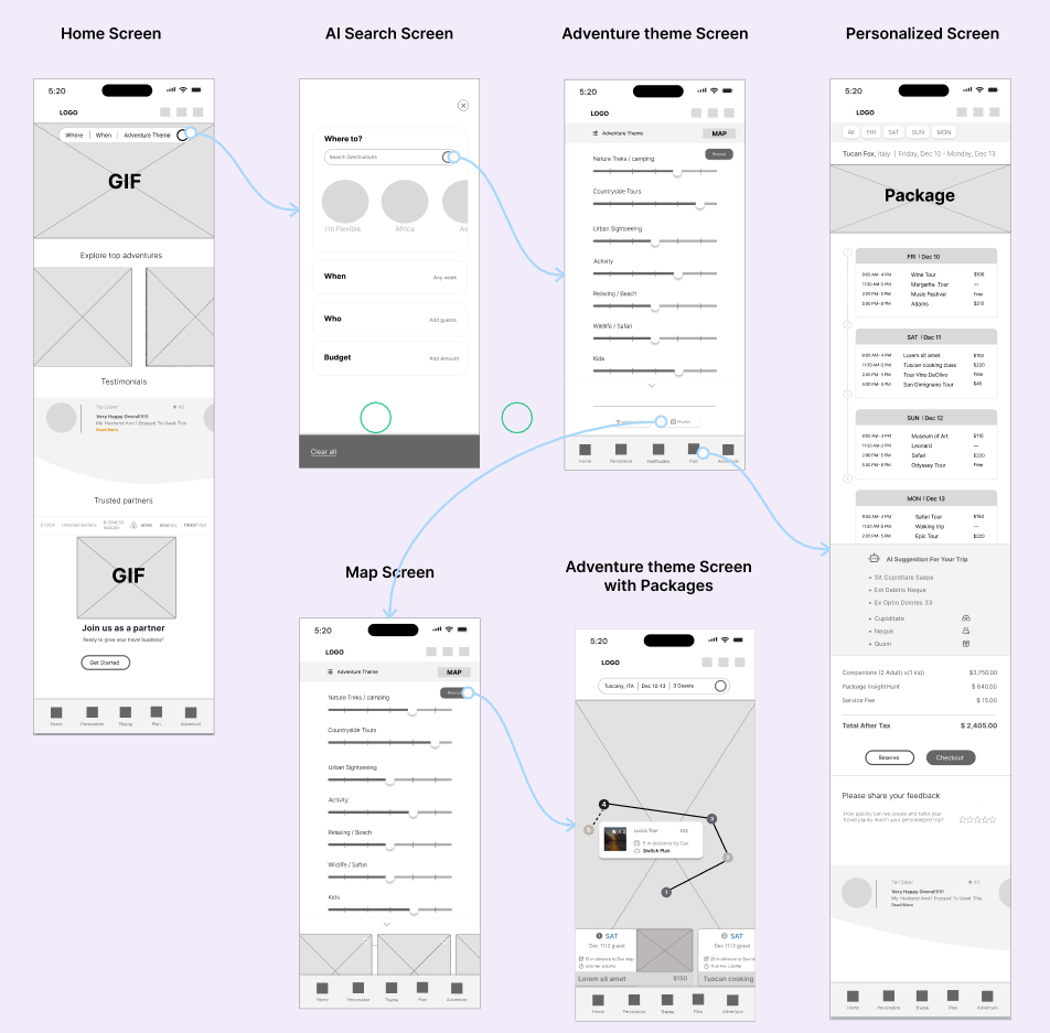
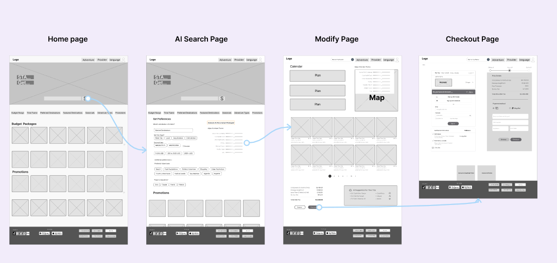
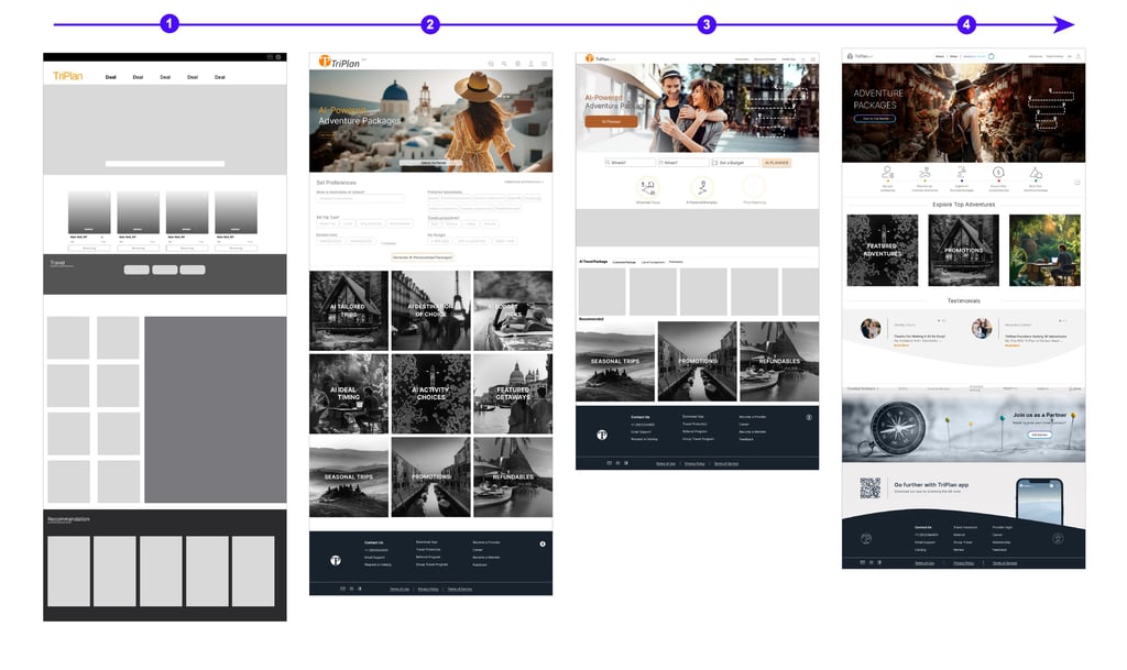
We created low-fidelity wireframes to plan how each page of the Tripan website would look for better communication with our team and to map out our ideas. We revised these sketches several times before finalizing the design.
Mid-Fidelity
We used Figma to create mid-fidelity designs and refine them before moving on to the detailed design process.
Mobile Screens
Desktop Pages
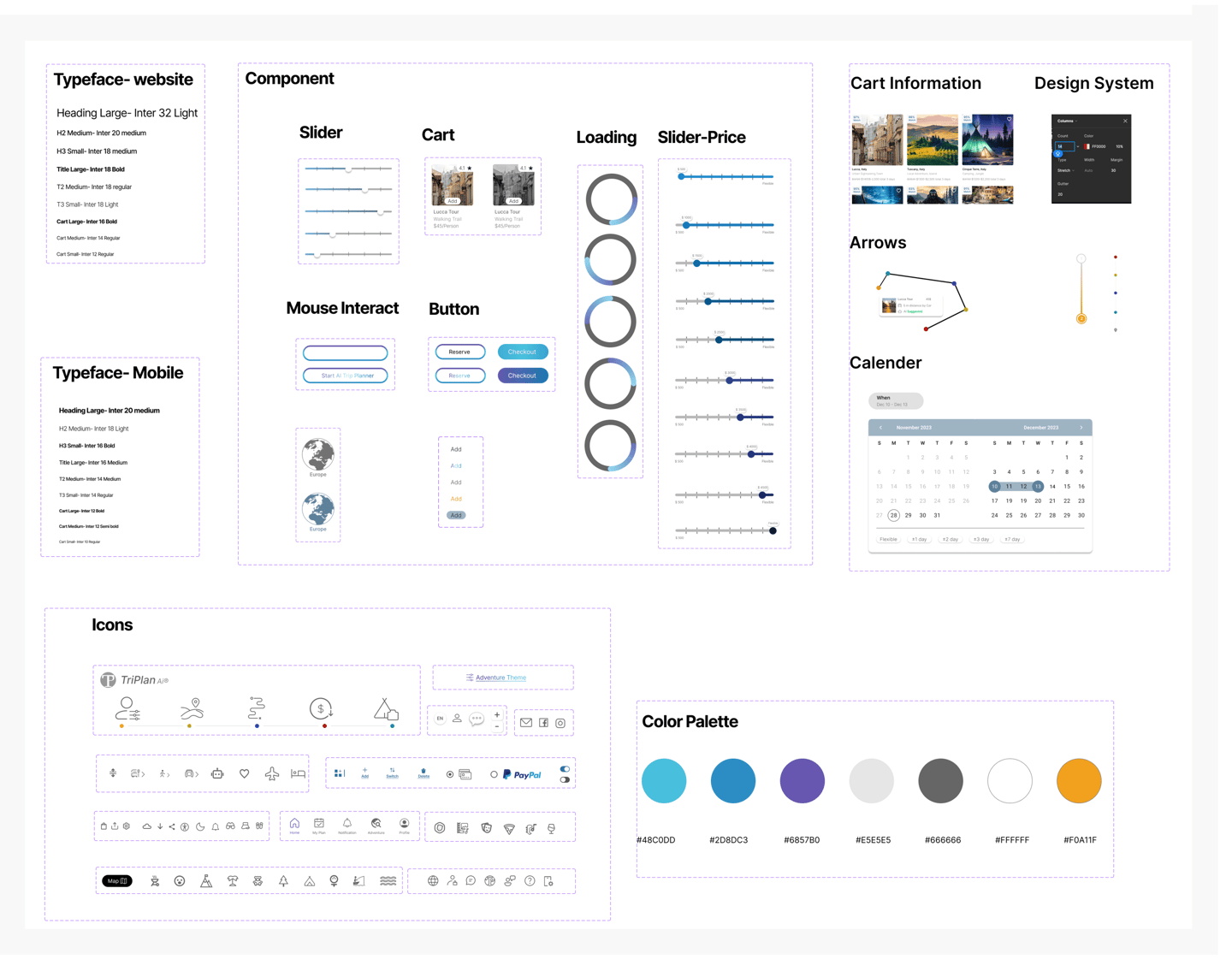
UI Kit
Based on the mode board, we've created a UI kit to keep our design process efficient and consistent.

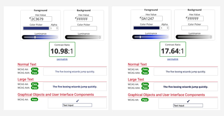
Color Accessibly
The contrast between the foreground and background colors of the primary and secondary buttons was tested on websites that evaluate color blindness, ensuring their acceptability.
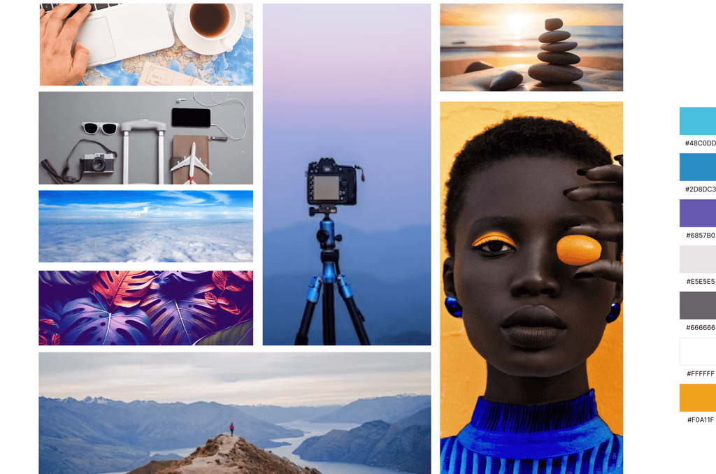
MoodBoard & Color Palette
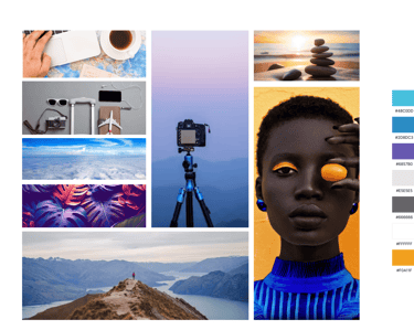
For the high-fidelity interface design, I defined a design system with consistent colors, fonts, and element dimensions across all screens. We created a mood board incorporating elements that evoke a travel vibe and convey softness and trust through carefully chosen colors.
ITERATE
Usability Test
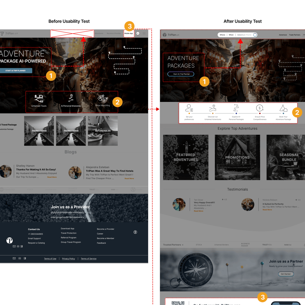
We tested the process of choosing a package and modifying a travel plan for 10 people. Throughout the project, we iterated multiple times, guided by insights from usability tests. These tests were crucial in shaping our decisions and continuously enhancing the project.
Home Page
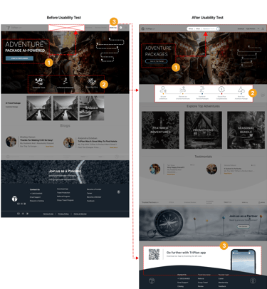
We discovered that travelers typically use both the CTA and the search bar menu at the top for their searches. So, after usability testing, we moved the search menu to the top and included it as a CTA. In the previous design, the AI search feature was not easily recognizable because it was blue and looked like a regular search bar. After usability testing, we changed it to a gradient of blue and purple to distinguish it as an AI search feature.
The value proposition of the TriPlan website proudly highlighted personalized adventure preferences, initially featured in the hero image as three key points. After usability testing, we added two more points and moved the value proposition below the hero image for better visibility and user engagement.
TriPlan offers both a website and a mobile app for travelers, making it beneficial and easier to use and download during travels. That's why we emphasized it and included a tab in the header navigation. However, after usability testing, we found that users didn't notice or open the tab. To address this, we added a barcode and image on the homepage to improve visibility.
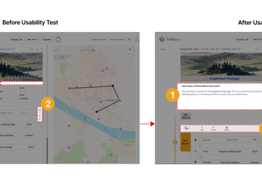
Modify Page
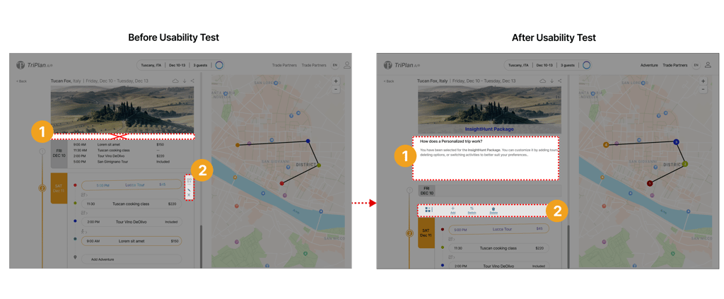
On the modify page, the top of the modification options lacked a description for adding, deleting, or switching items. To address this, we added a GIF with a descriptive caption below it.
Also, the modify option is crucial as it allows users to change their plans. First, the icon was small and placed vertically beside the daily plan. After testing, we found that the icon was too small and needed to be moved above in a horizontal layout for better visibility and eye-tracking on the page.


Notifiation Screen
In the notification screen before usability testing, we designed an overlay screen for when users modify a plan. However, it was difficult to navigate because it lacked detailed information on the tour, offers, and the reasons behind AI suggestions. Users also couldn't track it on a map. After usability testing, we discovered that users needed to see the offers on the map along with other information suggested by our AI.
Before Usability Test
After Usability Test
Deliver
Design Iteration
Through multiple iterations, our Website underwent significant refinement. Overcoming numerous challenges, we honed its accessibility, ensuring Traveler can easily find a package through AI search engine.
Hi- Fidelity
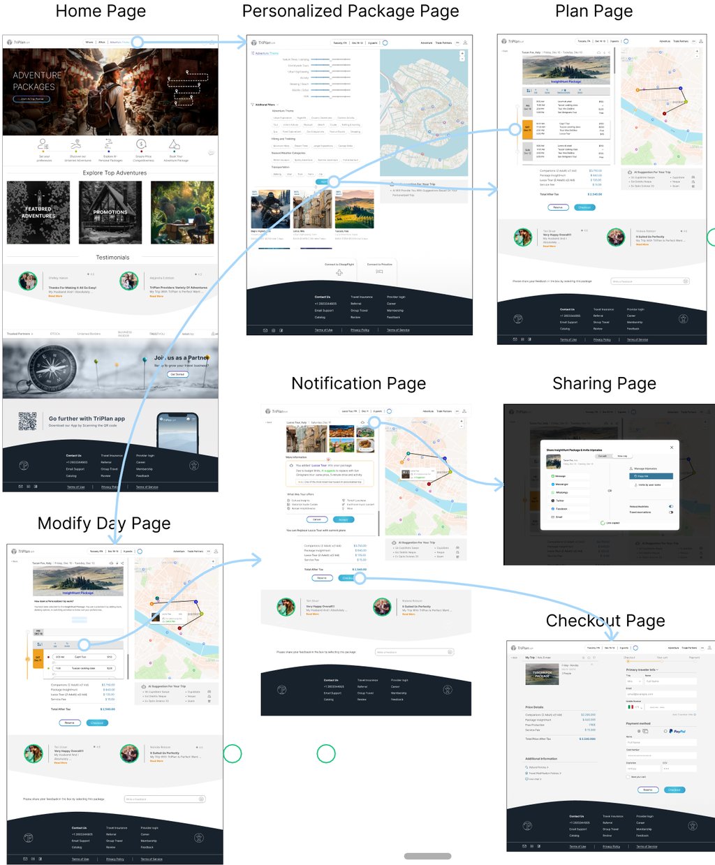
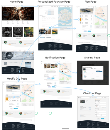
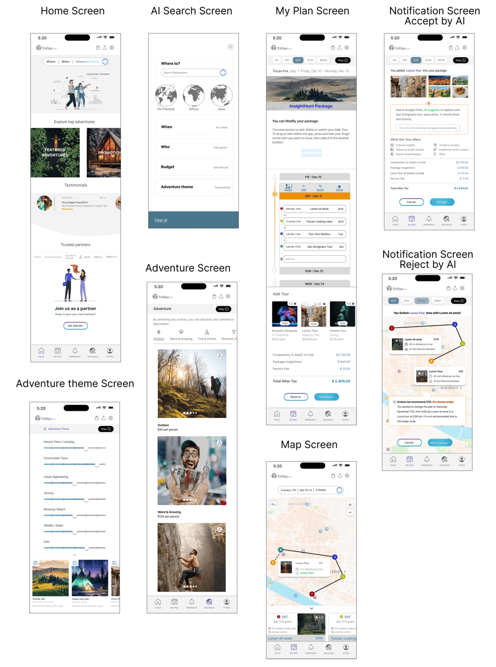
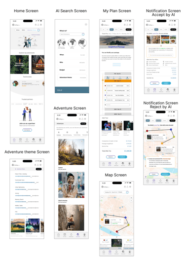
Desktop Pages
Main pages and user interactions appear in high-fidelity design.
Mobile Screen
View Desktop Prototype


_________________________________________________________________________________________________________________________________________________________________________
Reflection
What did I learn?
Clear Transparency: Simplify AI functions for travelers to understand easily, fostering trust.
Stay Updated: Incorporate latest AI search practices for cutting-edge user experiences.
Iterative Testing: Improve design through iterative testing for cleanliness and informative content.
Persistent Search Access: Allow search access from any page for seamless navigation.
Balanced Color Theme: Choose colors blending AI sophistication with human warmth for a visually appealing interface.
Next Steps?
Focus on enhancing the sharing section to allow plan sharing with family and friends, including additional options and privacy settings.
Integrate the daily plan into the calendar for review.
Conduct usability testing for better clarification and improvements.
