Berolina Bakery Website
Redesign a Bakery website by considering an order online


Berolina Bakery is a B2C website that focuses on two essential elements: bread and cake. Our team of three designers has taken on the task of redesigning the website, with a particular emphasis on enhancing the design and user experience of the online ordering tab. As UX designers, we're committed to making it easier and more enjoyable for customers to order their favorite baked goods online.
Timeline
1 Months-Part time
Teams
Group of 3
My role
UX design
Project Overview
Target
This bakery targets residents of California, with the option for delivery to other states across the USA
Tools




Problem Statemet
Berolina Bakery primarily focuses on online orders, but its categories page lacks subcategories for each type of bread, based on daily availability, bread type, or nut-free options.
The existing Berolina Bakery website lacked a modern design and intuitive navigation. Resulting in a suboptimal user experience.
Customers faced challenges to navigate products, and the outdated interface failed to showcase the bakery's artisanal charm effectively.
Cluttered Layout: Too much information and many images make it hard for users to focus on key elements.
Goal
We need to design a website for Berolina Bakery, a renowned artisanal bakery, sought to improve its online presence and user experience (UX) through a website redesign.
to create a visually appealing and user-friendly platform that reflects the bakery's unique identity.
Sell a Gift card for special day.
Discover
Heuristic Evaluation
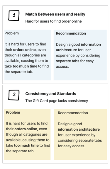
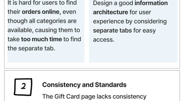
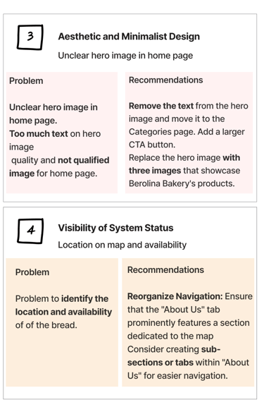
We initiated the project with a heuristic evaluation to identify pain points in the User interface design of the online ordering tab and Gift card and bread category organization.
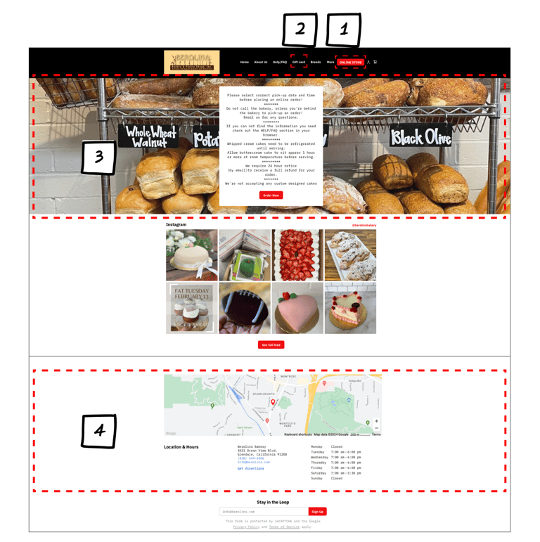
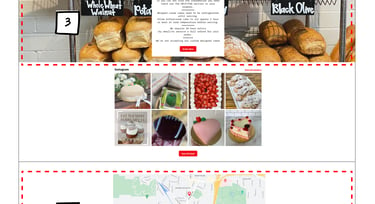
To understand how we can redesign a Bakery website to encourage users to use it regularly, we conduct heuristic evaluation, interviews, and check out our competition.
Competitive Analysis
At the same time, we are also using competitive analysis to identify the strengths and weaknesses relative to our product.
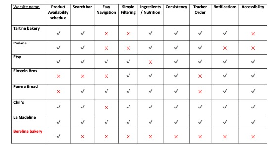
In reviewing competitor websites, we discovered that Berolina Bakery lacked several key features. Two particularly useful tabs in our bakery's interface are the Product Availability Schedule and the Order Tracker, both designed for easy navigation.
To streamline the online ordering process, we are implementing a seamless Order Tracker, ensuring the easiest and most efficient user experience.
Define
User Journey Map
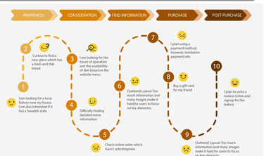
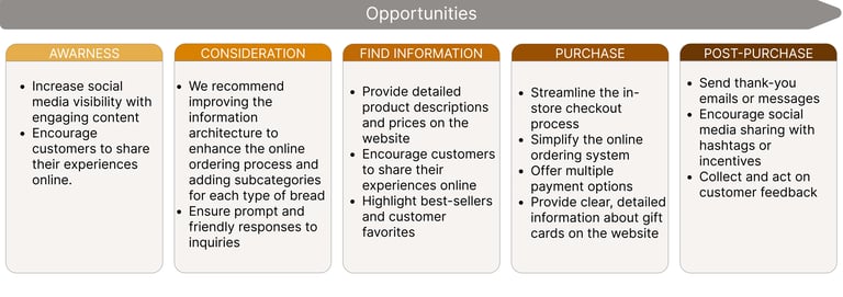
Below is an enhanced journey map for Berlina Bakery, specifically addressing an online order process where a customer experiences confusion.
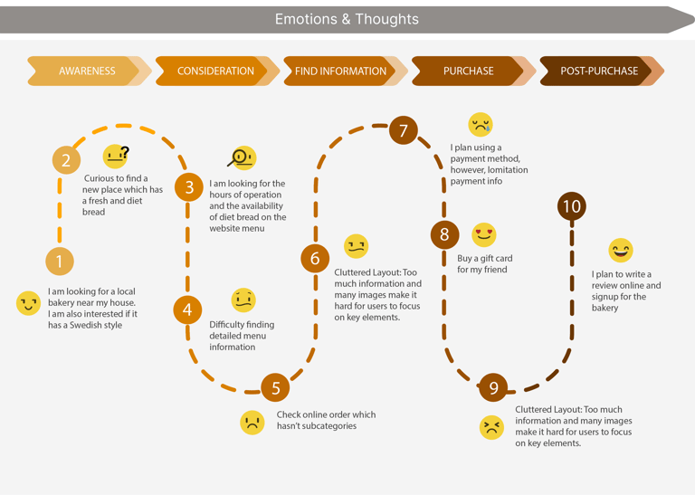
Customization options are unclear and hard to navigate.
Some online ordering options, like bread, are confusing.
Customers worry if their order was customized correctly.
Lack of immediate support during the ordering process.
Mixed feelings about the ordering process despite liking the product.
Addressing these issues can greatly improve the customer experience and streamline the online ordering process.
persona
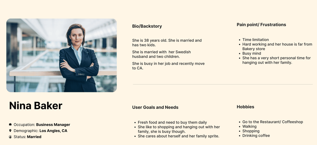
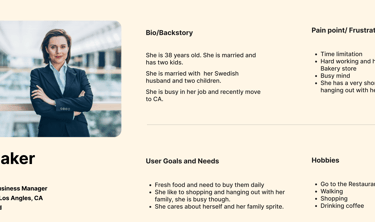
The website redesigned based on persona's needs and pain points.
Two important things for Sara: she cares about fresh food and bread for her family's health, and she lives out of town.
Card Sorting
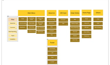
To better organize the website sections according to user expectations, we conducted both online and in-person card sorting sessions with 15 people. These activities aimed to improve the navigation menu. The results from our analysis informed the redesign of the information architecture and the site map.

Site map
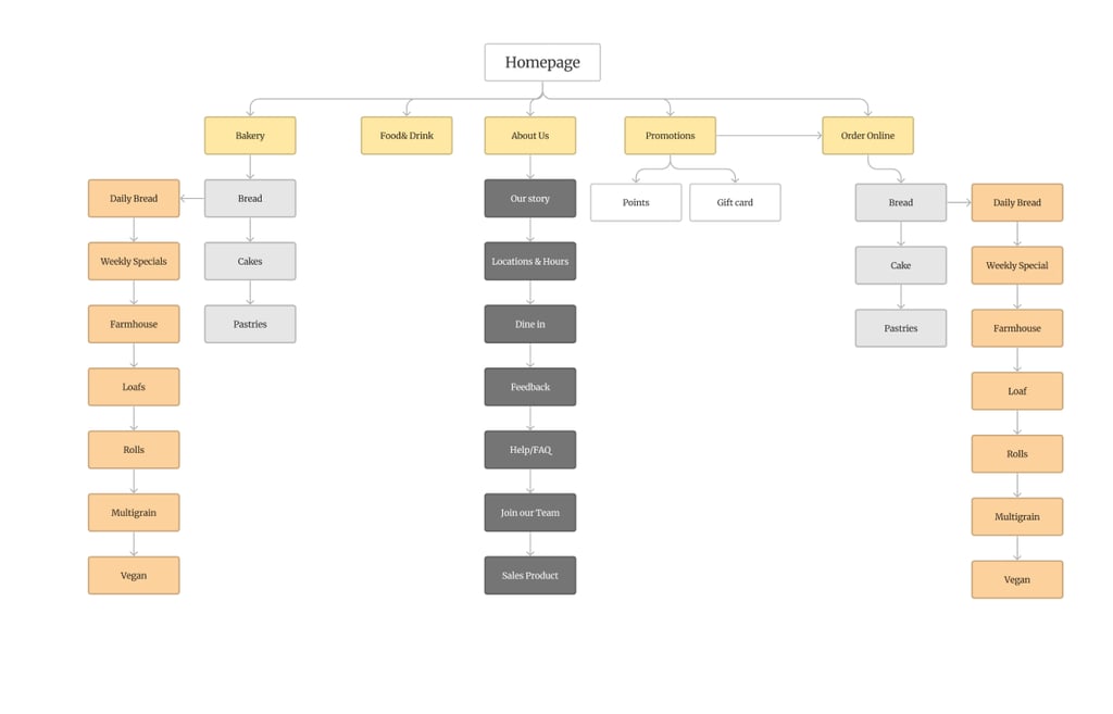
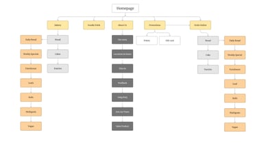
Based on the results of the competitive analysis and card sorting, we developed the site map to refine the information architecture. We included a Promotions and order online tab in the global navigation bar.
Develope
Mid-Fidelity
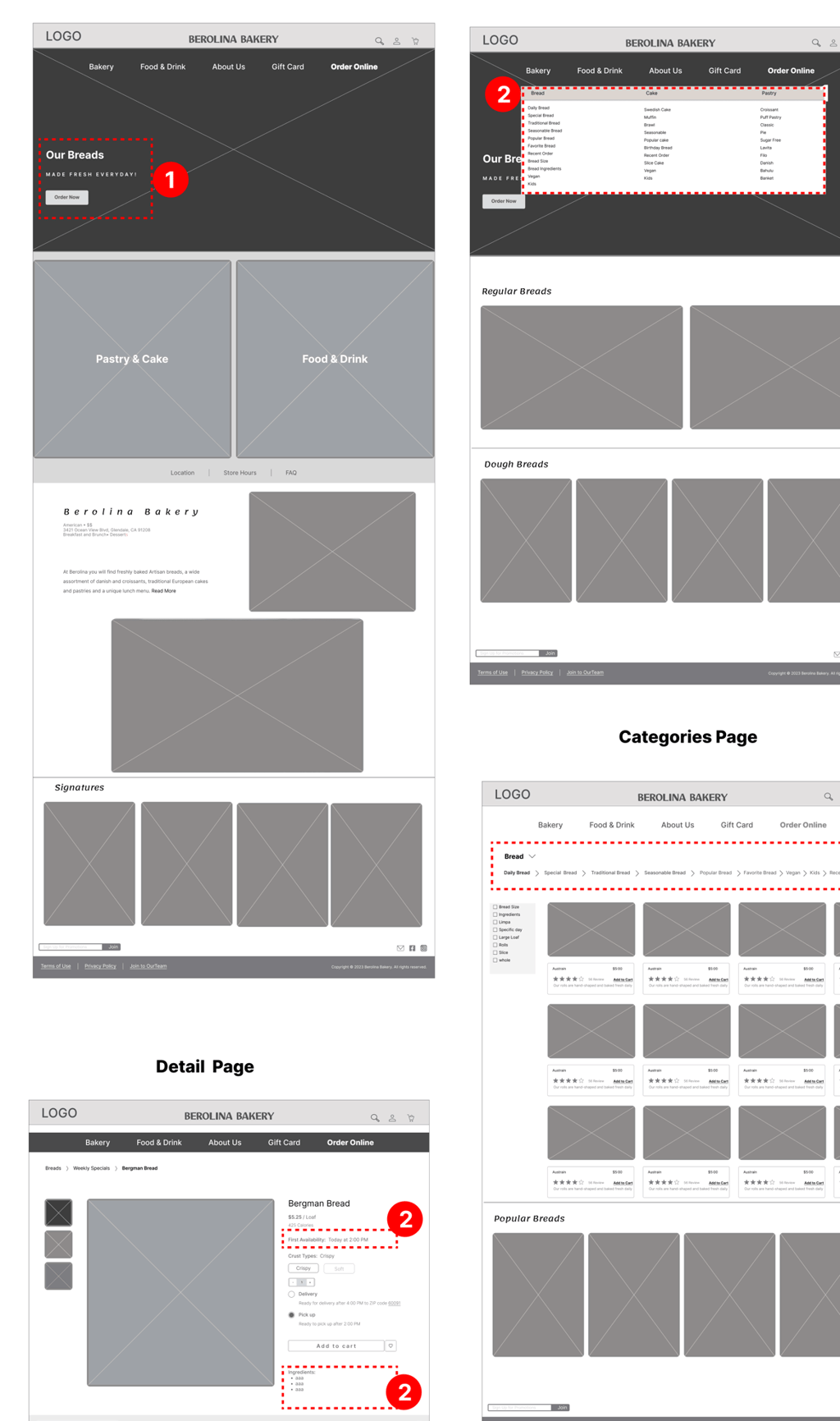
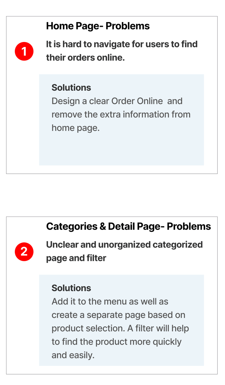
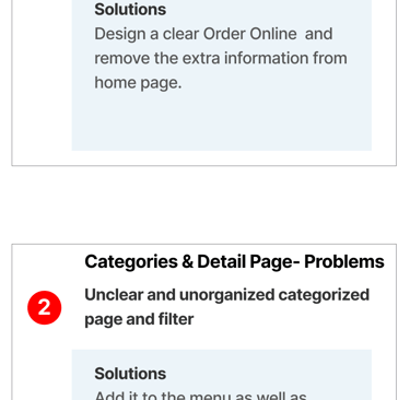
The important takeaway from our research includes identifying the key problems and finding their solutions. Please find the details below.


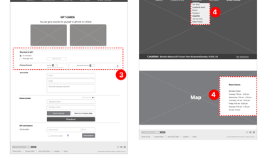
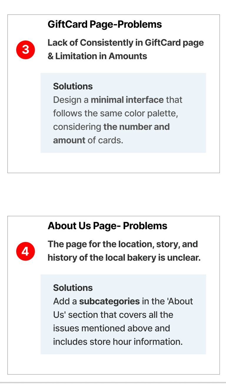
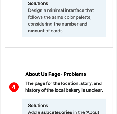
Usability & Iteration (Phase 1)
After conducting usability tests on the mid-fidelity prototype, several key issues were identified. Here are the problems along with their respective solutions.
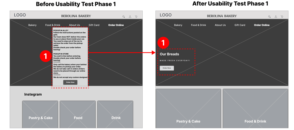
Home page
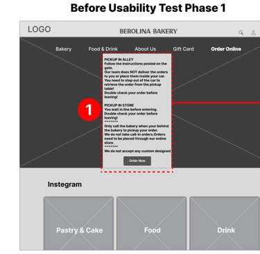
The home page CTA had too much information, causing confusion.
Users preferred a simpler, more direct online ordering process.
Revised Design
Simplified CTA: Removed unnecessary details.
Relocated Info: Moved location and availability details to the About Us page.
These changes streamline the ordering process and enhance clarity.
GiftCard page
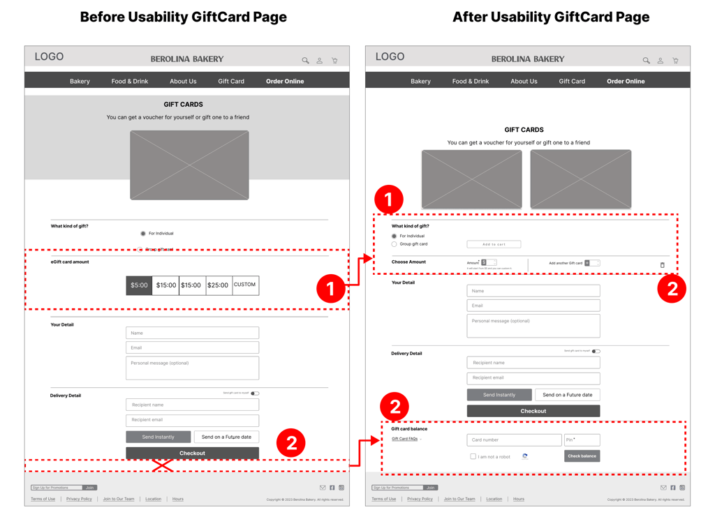
Users had to manually enter the amount for gift cards and there was no option to check gift card balance.
Users preferred using arrows to select the amount and wanted a balance check feature.
Revised Design
Simplified Amount Selection: Replaced manual entry with arrow buttons.
Added Balance Check: Included a section to check gift card balance before ordering.
These changes simplify the purchase process and enhance functionality.
Deliver
UI Design
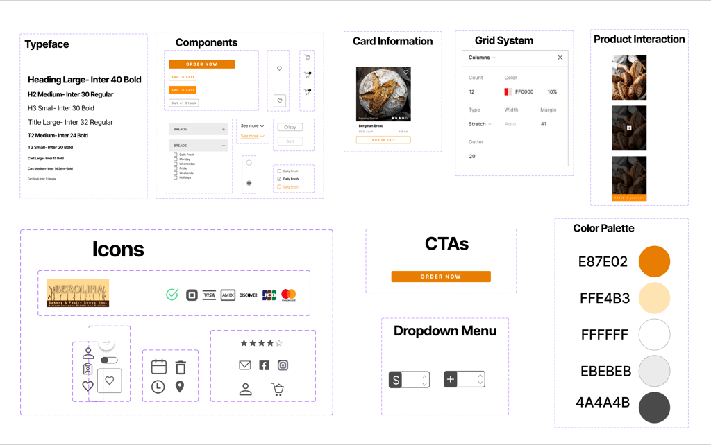
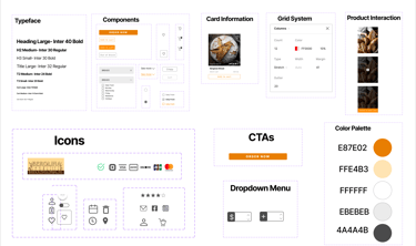
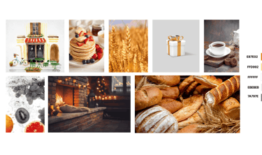
Orange suggests freshness and warmth, making customers feel welcome. It excites and stimulates hunger, encouraging impulsive buys. The playful vibe attracts families, while positive emotions increase loyalty. Its visibility makes the bakery stand out, enhancing appeal and customer attraction.
Color Accessibility
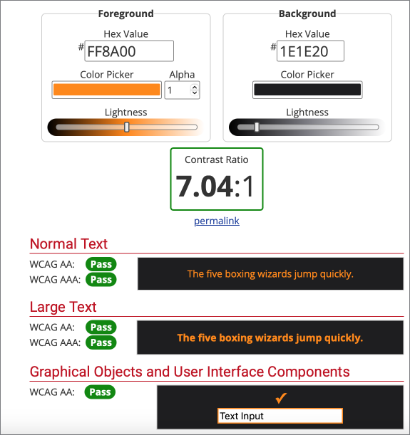
The contrast between the foreground and background colors of the primary and secondary buttons was tested on websites that test color-blindness, to ensure its acceptableness
Moodboard
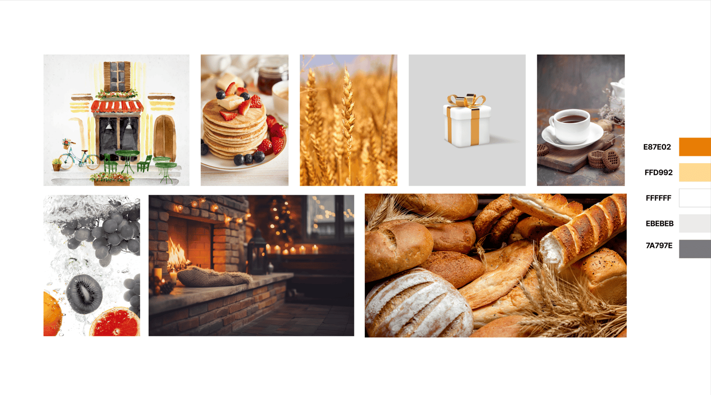
To evoke a sense of warmth and sweetness, the bakery's design enhances the sensory experience. It appeals to customers' senses of smell and sight, creating a welcoming atmosphere that feels both inviting and delicious.
Usability & Iteration (Phase 2)
Categories Page Design
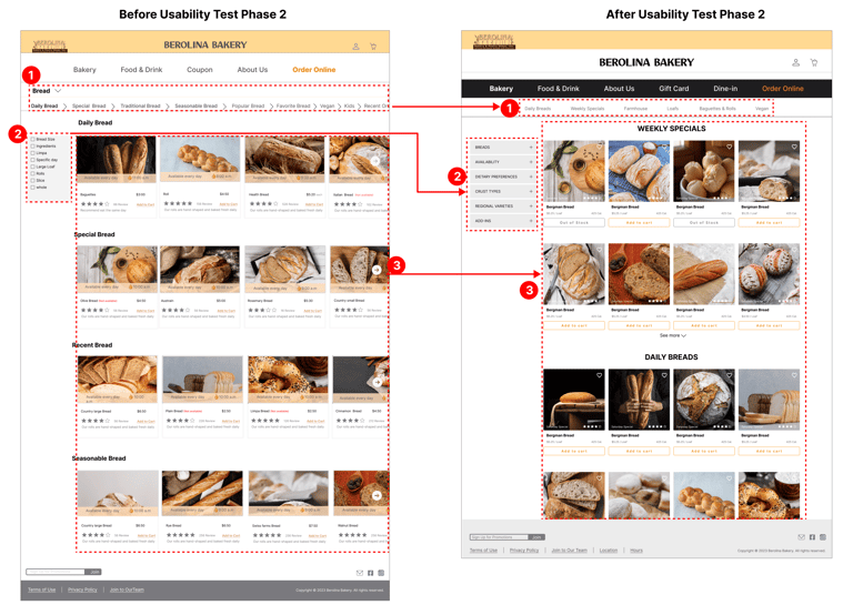
Initially, we used breadcrumbs for navigating main and subcategories.
Feedback from Usability Test (Phase 2)
Users preferred:
Subcategories Alongside Main Categories: More intuitive navigation.
Photos and Accordion Menu: Visual representation and expandable sections.
Clickable Categories: Easy expansion and scrolling for more options.
Revised Design
Side-by-Side Display: Main and subcategories.
Accordion Menu: Clickable and expandable categories.
Incorporated Photos: Enhanced visual appeal.
Detailed Bread Page Design
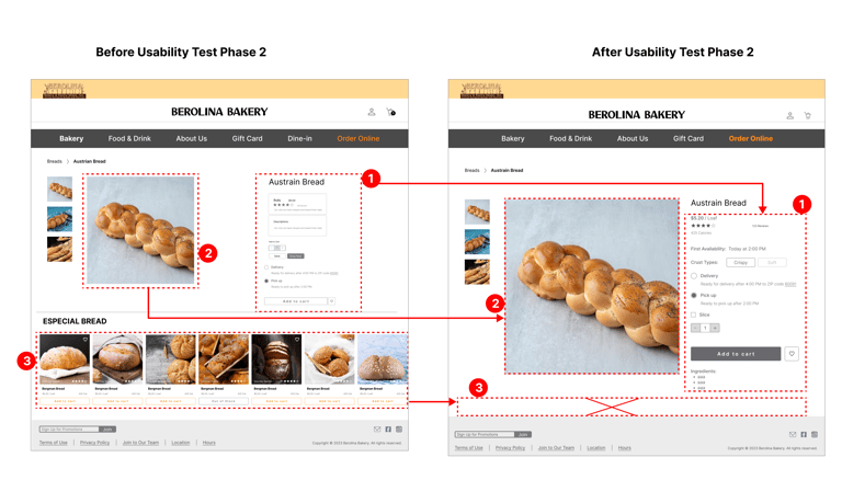
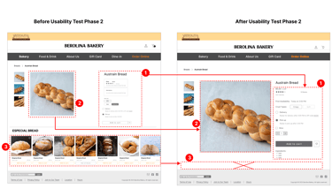
Initially, the detailed bread page lacked ingredient information and featured small bread images with ads for other breads at the bottom.
Feedback from Usability Test
Users wanted:
Ingredient Information: Missing in the initial design.
Larger, High-Quality Images: Preferred over small images.
No Confusing Ads: Ads for other breads were ignored and caused confusion.
Revised Design
Added Ingredient Information: Now included for each bread.
Larger Images: High-quality images for better viewing.
Removed Ads: Ads moved from the detailed page to the basket page.
High Fidelity Prototype
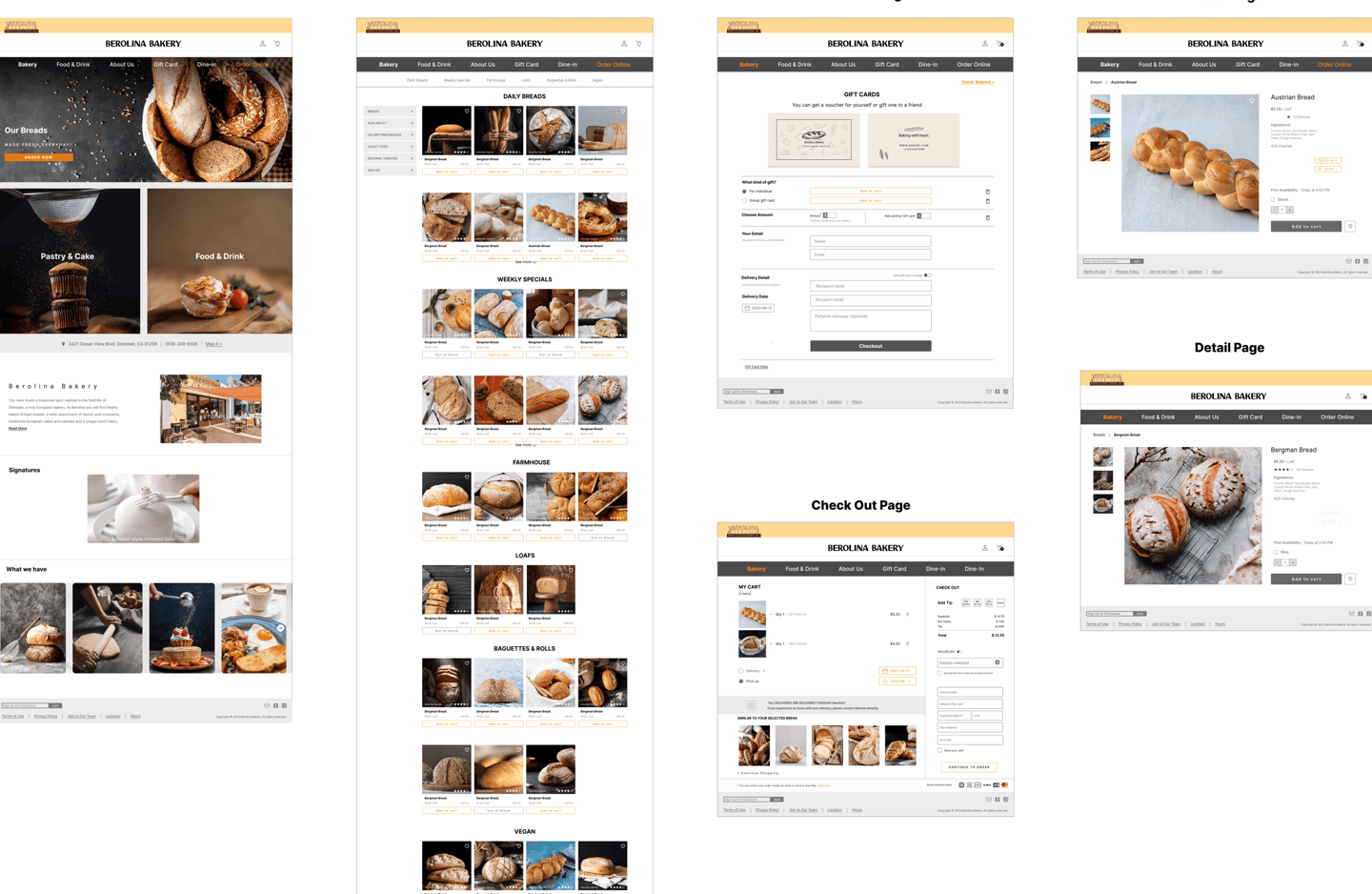
After multiple iterations, the high-fidelity prototype now features:
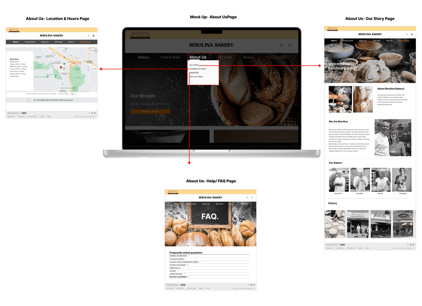
Subcategories for Time and Location: Addressing the key user questions identified in usability tests.
Separate Tabs for Story, History, and FAQ: Simplifying navigation and making information more accessible.
These improvements streamline the user experience, making the process faster and more convenient.
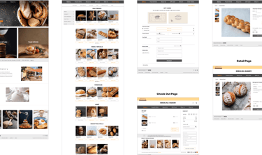
Finalize website content
Reflections
What Did I Learn?
Working on a team to redesign the Berolina Bakery website made it easier to compare previous designs and identify the main pain points of users.
The team taught me the importance of constant communication, especially during the project's early stages.
As a UX designer, I learned the value of iterative design and how to manage unexpected changes and client expectations.
Next Steps?
Our next steps are to evaluate the current design and conduct usability testing with elderly users to ensure accessibility and inclusivity.
Also, we should focus on refining other tabs, especially the Dine-In section.
